(FOR CONTENT PROVIDERS) How visuals help incarcerated adults remember, reflect, and repeat
Dual-coding theory for the win (even without Wi-Fi)
When text overload shuts the brain down
You open a required training book and immediately know how this is going to go.
Tiny font.
Endless paragraphs.
Zero white space.
It is giving DMV manual energy.
You tell yourself you will read carefully. You might even grab a highlighter. Maybe a pen. You are doing all the right things.
You make it three sentences in before your eyes start sliding off the page.
A few paragraphs later, you are technically reading but absorbing nothing. You are highlighting words without knowing why. Your mind is elsewhere. You check the page count.
Bad move.

Now here is the part we do not say out loud often enough.
If we would not want to spend hours learning like that, why would we expect learners on Edovo to?
Especially learners who may be:
Reading on a small tablet
Learning in loud, unpredictable spaces
Carrying stress, trauma, or academic baggage
Often reading around a 4th-6th-grade reading level
For incarcerated adults, text-heavy instruction is not just boring. It is cognitively expensive. And when the cost feels too high, the brain does what it always does under pressure.
It checks out.
To be clear, there is a time and place for longer texts. Deep reading, legal materials, personal reflection, and sustained study all have real value. This article is not arguing against depth or rigor.
What it is arguing for is intentional design.
Most instructional content works better when it respects how the brain actually processes information. Especially in digital, self-paced environments. Especially under stress. Especially when attention, literacy, and confidence are fragile.
The principles in this article apply to the majority of learning moments on Edovo. The moments where clarity matters more than coverage. Where momentum matters more than endurance. Where remembering one usable idea is more valuable than skimming ten.
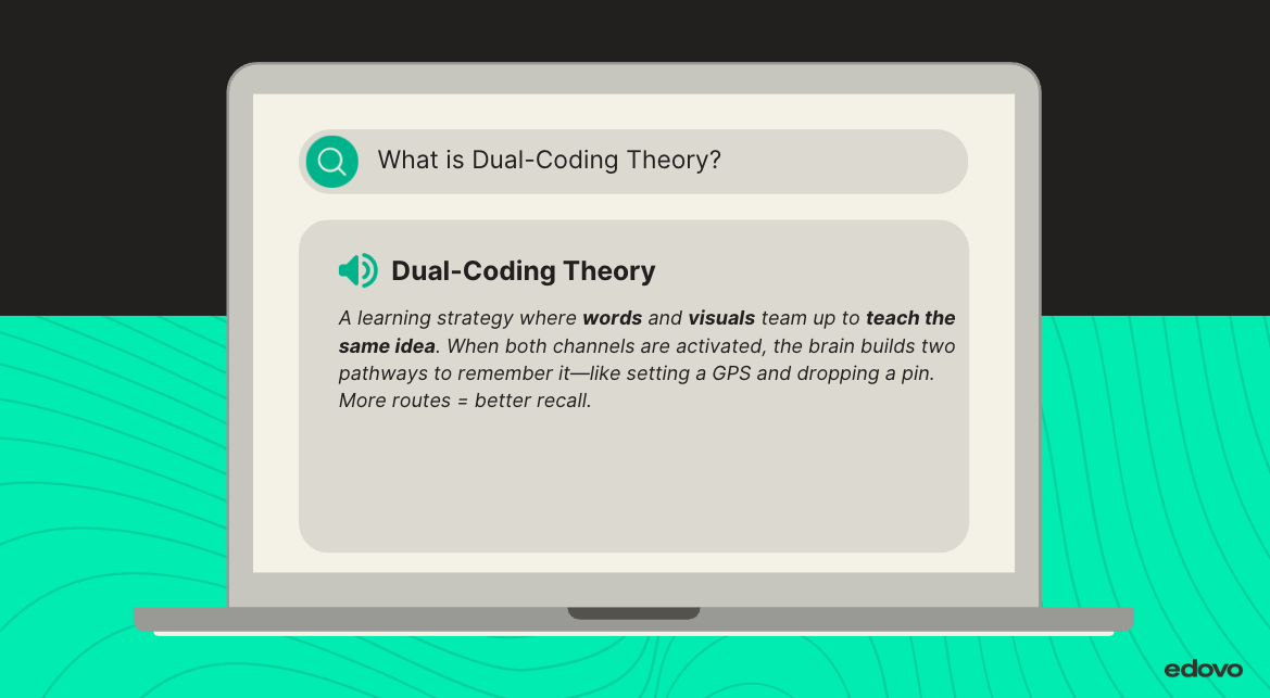
This is where dual-coding theory comes in.
Decades of cognitive research show that the brain learns better when information is presented through both words and visuals. Two channels. Two ways in. Less strain on working memory. Better recall when it actually matters.
Inside Edovo’s closed, self-paced environment, visuals are not decoration or flair. They are instructional tools. They help learners stay oriented, reduce overload, and make meaning stick when attention is fragile.

In the rest of this article, we are going to:
Break down what dual-coding actually is without the jargon
Show why text-only lessons fail under stress and distraction
Walk through practical, low-tech ways to use visuals inside Edovo
Call out common visual mistakes that quietly undermine learning
Because the goal is not to make content prettier.
It is to make it survivable.
And better yet, memorable.
If a page full of dense text has ever made you sigh and think, “This is going to be a long hour,” you already understand the problem.
Now let us talk about how to fix it.
The jargon you actually need to know
What the science says: First introduced by Allan Paivio and expanded by Richard Mayer, dual-coding improves recall, reduces overload, and helps learners transfer information to real-world action.
How to use it on Edovo: Pair icons with key terms. Use labeled diagrams for multi-step processes. Reinforce key ideas visually across multiple pages.
The brain loves a double feature
Dual-coding is simple in theory and powerful in practice. Every time you teach an idea, the brain should get two ways in: one verbal and one visual.
Here is the rule of thumb you can use for almost any content.
If something matters enough to explain, it matters enough to show.
Let’s say you are building a course on managing emotional reactions.
Instead of dumping a list of symptoms and strategies into one long paragraph, apply these dual-coding design rules:
Rule 1: One idea, one visual
Pair each key strategy with a simple image or icon. Not decoration. Clarification. The visual should reinforce the exact idea the text is teaching.
Rule 2: Turn sequences into flow
Any process with steps should be shown as a visual sequence. For example, pause → breathe → reflect → respond. Flow reduces cognitive load and helps learners see how actions connect.
Rule 3: Be visually consistent
Use the same visual language across screens. If red represents reaction and green represents reflection, keep that rule everywhere. Consistency builds recognition and trust.
Rule 4: Reduce, do not embellish
Simple visuals beat clever ones. Shapes, arrows, icons, and labels work better than abstract or symbolic images that require interpretation.
When you design this way, learners get:
-
A visual way to orient themselves on the screen
-
A second route to understanding when text alone is hard
-
A memory anchor they can recall later, especially under stress

What this actually looks like on Edovo
Edovo does not support embedded links, autoplay video, or flashy animations. That is not a limitation. It is a design constraint that rewards clarity.
Dual-coding on Edovo is about using intentional visual language so learners can understand the point of a screen at a glance.
In practice, that means:
Use visuals to signal what matters
Create simple header images that include a clear icon tied to the core idea of the screen. The icon should preview the concept before a single word is read.
Turn key ideas into visual anchors
For foundational concepts, use clean infographics that show relationships, categories, or contrasts. One concept per graphic. If the visual cannot be explained in one sentence, it is doing too much.
Repeat visual cues on purpose
Use the same symbols for the same function across the course. The same icon for reflection. The same symbol for a warning or pause. Repetition builds familiarity and reduces cognitive effort.
Show every process, do not just describe it
Any time learners are asked to follow steps, label each step with both words and a visual. Arrows, numbers, and icons help learners see sequence and direction without rereading.
Design for fast orientation
A learner should be able to answer, “What is this about?” within five seconds of opening the screen. If they cannot, the screen needs fewer ideas or clearer visuals.
A low-tech challenge with high-impact results
Grab any lesson you’ve already built. Pick one block of text.
Ask yourself:
What part of this is hard to visualize?
Can I sketch it with shapes, arrows, or simple icons?
Would this help someone who reads at an elementary level?
Visual design is a form of accessibility. On Edovo, it’s also a form of dignity.
Where visuals go wrong
Not all visuals are created equal. The wrong image doesn’t just fall flat—it can confuse, distract, or even derail the learning process. Here’s what to avoid:
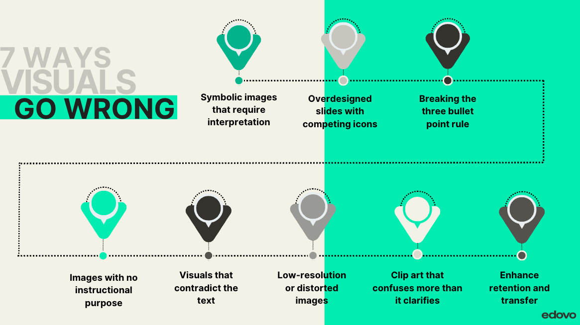
Clip art that confuses more than it clarifies
If your learner has to guess what it’s supposed to represent, it’s not helping.Symbolic images that require interpretation
A scale for “balance” or a maze for “choices” might look clever—but abstract visuals increase cognitive load, especially for stressed or low-literacy learners.Overdesigned slides with competing icons
Too many visuals on one screen = instant overload. Simplicity signals clarity.Breaking the three bullet point rule
More than three visual elements on a screen (unless they’re part of a structured list or table) often causes visual clutter. Think in groups of three to guide focus.Images with no instructional purpose
If it’s just decoration, it’s a distraction. Every visual should teach something—or it doesn’t belong.Visuals that contradict the text
A smiling person next to a definition about stress regulation? That disconnect can erode trust and comprehension.Low-resolution or distorted images
Blurry graphics scream “not worth your time.” If it looks cheap, it feels unimportant.
Your visuals should teach. If they don’t, they’re just noise.
Try it out for yourself, which visual would you find easier to look at:
Test before you rest
Quick self-check:
Does each image reinforce a specific idea, not just decorate it?
If my learner couldn’t read, could they still follow the flow?
Would this visual help them use the concept later?
If yes, you’ve nailed the fundamentals of dual-coding in a closed correctional setting.
Bringing it all together
Here’s what matters: incarcerated adults don’t need more text. They need more access.
Dual-coding turns instruction into connection. It builds comprehension, boosts confidence, and creates paths to real-world action. And on a platform like Edovo, that kind of learning doesn’t just stay on screen—it walks out with them.
TL;DR: Two tracks are better than one
Dual-coding = pairing visuals with words to deepen memory and understanding
It’s essential for adult Learners in corrections, especially those facing trauma and low literacy
Works seamlessly inside Edovo’s self-paced, closed digital system
Skip the fluff—design visuals that clarify, reinforce, and repeat
One image, when done right, can carry the weight of an entire lesson
References
Clark, J. M., & Paivio, A. (1991). Dual coding theory and education. Educational Psychology Review, 3(3), 149–210. https://doi.org/10.1007/BF01320076
Mayer, R. E. (2005). The Cambridge handbook of multimedia learning. Cambridge University Press.
The Learning Scientists. (2017, March 30). What is the dual coding strategy? https://www.learningscientists.org/blog/2017/3/30-1
InstructionalDesign.org. (n.d.). Dual coding theory (Paivio). https://www.instructionaldesign.org/theories/dual-coding/
University of Queensland. (n.d.). Dual coding strategy – Cognitive learning design. https://itali.uq.edu.au/files/8034/dual_coding_strategy.pdf
SAMHSA. (2014). SAMHSA’s concept of trauma and guidance for a trauma-informed approach. https://ncsacw.acf.hhs.gov/userfiles/files/SAMHSA_Trauma.pdf
Provides trauma-informed design principles that shape Edovo’s approach to pacing, accessibility, and Learner emotional readiness.
Related Articles
(FOR CONTENT PROVIDERS) The 9 Moments That Make or Break a Digital Course
Let’s start with some good news: Most digital courses don’t fail because the content is bad. They fail because the learner gets lost. Lost in why the lesson matters. Lost in how to think about the information. Lost when they’re asked to do something ...(FOR CONTENT PROVIDERS) Why Learners Drop Off and How to Design Courses That Keep Them With You
Why learners might be zoning out and what to do about it: A practical guide to cognitive load, learning science, and designing courses that support learning success. (Buckle up. This is a longer article on purpose. We’re covering a lot, but it’s the ...(FOR CONTENT PROVIDERS) How to help learners retain your content
What is spaced learning—and how do you use it without making your content feel like Groundhog Day? Ever “learn” something and forget it 24 hours later? You studied. You underlined. You told yourself this time you had it. Then someone asked you about ...(FOR CONTENT PROVIDERS) Designing Learner-Centered Content for Incarcerated Adults
Designing learner-centered content that listens as much as it teaches The importance of designing learner-centered content that listens as much as it teaches Ever been on a tour where you didn’t get to ask questions? You show up. The guide launches ...(FOR CONTENT PROVIDERS) How to Anchor Lessons for Incarcerated Learners
How to help learners connect new content to what they already know (and why it matters) Have you ever rushed into a meeting 10 minutes late and instantly regret it? Have you ever rushed into a meeting ten minutes late and instantly regretted it? You ...