(FOR CONTENT PROVIDERS) Scroll fatigue is real when it comes to learning (we're not TikTok)
Why content density kills retention and how to space your screens for learning, not overload
Ever crammed three days’ worth of groceries into one small tote bag?
It feels efficient until the bag breaks. Eggs crack. Chips crush. And somewhere between the fridge and the pantry, you forget half of what you bought. (We’re all sighing together over here).
That’s what it’s like when you cram five paragraphs, two PDFs, a video, and three quiz questions onto one Edovo screen.
Sure, it fits. But the brain can’t carry that load, not without losing something along the way.
And when a learner is navigating a noisy dayroom, “meh” quality headphones, and a screen the size of a paperback book, what do you think they'll forget about? Their physical safety or the lesson on their tablet?
You’ll walk away with:
A science-backed understanding of why spacing boosts memory, motivation, and learning
The neuroscience of attention spans, dopamine, and memory retention
Concrete guidelines for how much content to include per screen
A breakdown of how to balance text, media, and tasks without overwhelming learners
The jargon you actually need to know
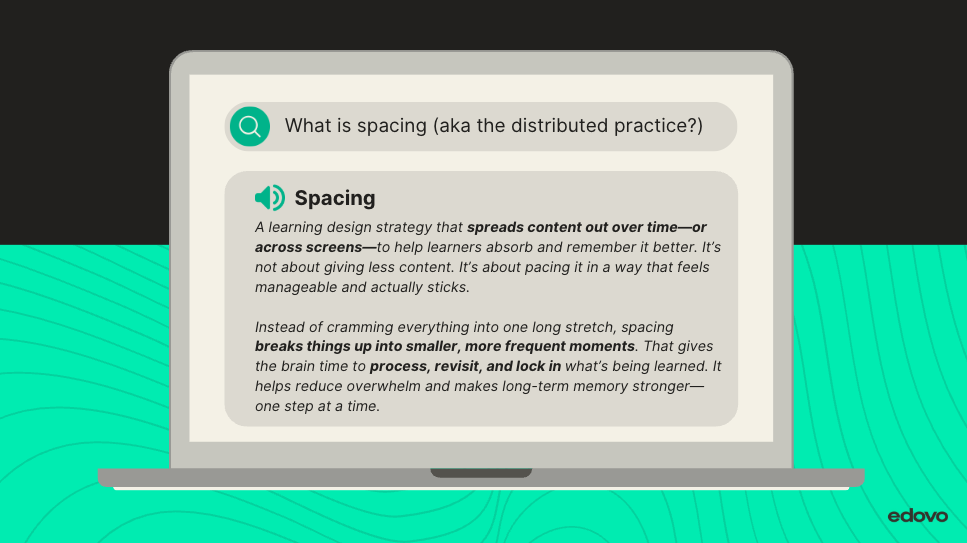
Term: Spacing (also called distributed practice)
What it is: Spacing is a learning design strategy that spreads content out over time—or across screens—to help learners absorb and remember it better. It’s not about giving less content. It’s about pacing it in a way that feels manageable and actually sticks.
Instead of cramming everything into one long stretch, spacing breaks things up into smaller, more frequent moments. That gives the brain time to process, revisit, and lock in what’s being learned. It helps reduce overwhelm and makes long-term memory stronger—one step at a time.
What the science says (and why it matters here)
Cognitive science is blunt about this. Learning sticks better when it is spaced, not stacked (Ebbinghaus, 1885; Cepeda et al., 2006).
Why? Because working memory, the mental space we use to make sense of new information, is both small and fragile.
Under ideal conditions, most adults can focus deeply for about 10 minutes before attention starts to fade (Bransford et al., 2000; Mayer, 2009). And at any given moment, working memory can hold only about 5–9 pieces of information, often summarized as “plus or minus seven,” before something gets dropped.
Now layer in reality.
When learners are under stress, distracted, or emotionally taxed, which is common in correctional environments, that capacity shrinks even further. The brain does not just get tired. It starts to triage, prioritizing survival over synthesis.
So when a lesson tries to teach twelve ideas at once on a single screen, the brain does not rise to the challenge. It quietly lets most of it go.
Not because the learner does not care.
Because the brain is doing exactly what it is designed to do.
A quick exercise (try this yourself)
Read this list once. Do not write it down.
F – K – R – T – M – L – S – Q – B
Now pause.
How many can you recall?
Most people land somewhere around five or six. That is working memory tapping out.
Now try this version:
FBI – KFC – MRT – MLS – QB
Same number of letters.
Very different experience.
Nothing magical happened. What changed was chunking. When information is grouped into meaningful units, working memory can handle it. When it is not, it collapses under the load.
This is why overpacked screens fail learners.
And why spacing works.
Spacing gives the brain time to encode, organize, and store information before the next demand shows up. It turns cognitive overload into cognitive progress.
It also does something else adults need. It creates a sense of forward motion.
Each time a learner completes a focused screen and taps “Continue,” the brain registers progress. That small win triggers a dopamine response. Momentum, confidence, and motivation to keep going increase (Immordino-Yang, 2015; Bransford et al., 2000).
Bottom line:
Overpacked screens feel productive to the designer. But to the learner, especially one navigating stress, noise, and interruption, it is just another bag that breaks.
So... how much is too much for a 10-minute lesson?
Let’s be clear: we’re not saying your content isn’t important or that there should be less content in a course. We’re saying the delivery matters as much as the message. Below is a science-aligned breakdown of how much content to include on a single page or screen in Edovo. If you're designing longer-form lessons, check out the article The brain called, it wants a break.
Recommended content limits per screen for short-form courses (about 10-minute lessons)
These are research-backed guidelines, not hard-and-fast rules. If there’s a strong, learner-centered reason to stretch a screen, like modeling a full conversation or showing a complete visual process, that’s okay. But in general, these limits exist for a reason: they align with how the brain learns best, especially in high-stress, self-paced environments like Edovo.
(Still skeptical? Check the References section; we didn’t make this stuff up.)
Gasp. We know. The moment you saw that 150-word limit, eyes widened. Maybe someone clutched their pearls. “How on earth is that possible?!”
Under 75 words: Great for focus, fast recall, and pacing. Encourages bite-sized learning.
75–150 words: Ideal for a full thought, short explanation, or setup + example.
Over 150 words: Acceptable when the added text serves a clear purpose like telling a story, modeling a process, or showing multiple perspectives. It's ok to go over, as long as it serves a clear purpose.
If you go longer:
Break up text into short paragraphs (2–4 lines max)
Use bolded subheaders to chunk ideas
Avoid mixing long text with video, audio, or multiple tasks (images/infographics are ok)
Follow with a screen that lets the brain breathe (reflection, recap, or simple question)
Bottom line: You can exceed the word count. Just don’t exceed the learner’s bandwidth. If in doubt, break it up.
Sample pacing map: Conflict resolution course (10-minute lesson)
Lesson goal: Introduce the “pause before reacting” strategy and apply it to a real-world situation.
Total lesson time: 10 minutes
Target screen count: 8–10
Core media types used: Short video, multiple choice, open response, survey
Bonus design tip:
If your course has more than one video, use this sequence every time:
Screen 1: Set up the video with a title, introductory text, and play the video
Screen 2: Provide a bullet point recap and maybe an image of a key moment from the video
Screen 3: Ask 1-3 questions about the video
This creates rhythm, builds retention, and gives the learner breathing room.
Common mistakes (and how to fix them)
Oops: Uploading multiple videos and PDFs onto one screen
Fix: Break them into separate screens, each with a guiding question or context
Try: “Watch this clip. What emotion do you notice most?” → then → “Now, check out this checklist to try it yourself”
Why it matters: Screens overloaded with files lead to passive scrolling—not active learning.
Oops: Dropping 5 quiz questions in a row after a wall of text
Fix: Space questions out between short content screens
Try: Text → 1 quiz question → new content → 1 follow-up question
Why it matters: Spacing reinforces memory and builds confidence in small steps.
Oops: Text-heavy screens with no breaks or emphasis
Fix: Use bolded headers, spacing, and formatting to highlight key ideas
Try: 1 core idea per paragraph. Bold what matters. Then let them click “Continue.”
Why it matters: Dense text overwhelms the eye and shuts down retention.

TL;DR: Less packed = more impact
Spacing isn’t about doing less—it’s about designing smarter
Short, focused screens reduce overload and improve memory
One idea, one media item, one task per screen
Clicking “Continue” reinforces momentum, confidence, and reward
Your Learner isn’t scrolling a blog. They’re building brain muscle. Let them breathe.
References
Bransford, J. D., Brown, A. L., & Cocking, R. R. (2000). How people learn: Brain, mind, experience, and school. National Academies Press.
Cepeda, N. J., Pashler, H., Vul, E., Wixted, J. T., & Rohrer, D. (2006). Distributed practice in verbal recall tasks: A review and quantitative synthesis. Psychological Bulletin, 132(3), 354–380.
Clark, J. M., & Paivio, A. (1991). Dual coding theory and education. Educational Psychology Review, 3(3), 149–210.
Ebbinghaus, H. (1885). Memory: A contribution to experimental psychology.
Guo, P. J., Kim, J., & Rubin, R. (2014). How video production affects student engagement: An empirical study of MOOC videos. Proceedings of the First ACM Conference on Learning at Scale, 41–50.
Immordino-Yang, M. H. (2015). Emotions, learning, and the brain. W. W. Norton & Company.
Knowles, M. S., Holton, E. F., & Swanson, R. A. (2015). The adult learner (8th ed.). Routledge.
Mayer, R. E. (2009). Multimedia learning (2nd ed.). Cambridge University Press.
Sweller, J. (1988). Cognitive load during problem solving: Effects on learning. Cognitive Science, 12(2), 257–285.
Related Articles
(FOR CONTENT PROVIDERS) What Are Edovo's Research-backed Methods for Real Results?
Where Learning Science Meets Real-World Correctional Education Our researched-backed methods are a series of practical, research-backed articles in Edovo’s Knowledge Base, created to help content partners design effective digital learning experiences ...(FOR CONTENT PROVIDERS) Design like a pro, even if you’re new to the Editor
You’ve got the structure down. You’ve avoided the classic missteps. Now it’s time to take your content from good to great. From film-based course structure to assessment writing, we’ll show you how to apply best practices without getting lost in the ...(FOR CONTENT PROVIDERS) Ask better questions (and get better learning)
10 Ways to Write Questions That Invite Thinking (Not Just Clicking) Learn how to design questions that do more than fill space. On Edovo, your questions are the interaction. This guide breaks down how to craft questions that build confidence, spark ...(FOR CONTENT PROVIDERS) Getting help with your active learning content creation: Edovo's professional services
Professional services, made personal Designing powerful, tablet-based learning experiences takes time, strategy, and a deep understanding of how incarcerated adults engage with digital content. That’s where our Professional Services come in. Whether ...(FOR CONTENT PROVIDERS) The brain called, it wants a break
The Science-Backed Way to Make Long Courses Feel Short (in a Good Way) We’re all fans of the quick-hit microlearning moment. It’s flashy. It’s digestible. It’s practically built for our dopamine-addicted brains. But let’s not pretend everything worth ...